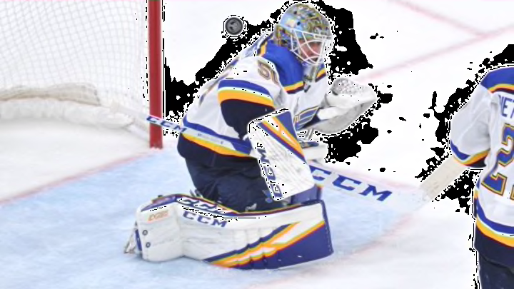
St. Louis Blues goaltender Jordan Binnington had his new mask unveiled for the 2019-20 season. It’s not as great as a champion deserves.
The St. Louis Blues starting goaltender and Stanley Cup champion, Jordan Binnington, had his new mask revealed on the St. Louis Blues Twitter account. It is a decent mask, but somewhat less than you would expect for a champion.
You know it’s that time of year when we delve into the design of masks. Right around this time every season, just before camp starts, you get the pictures of the new designs and, given that there is not a ton else to talk about, this becomes a topic.
Before we get too far, I want to say that I always respect all the work put in by the mask designers. They are more creative and talented than I could ever be in the aspect of design and, more often than not, are simply putting together something the goaltender asked for.
That said, this mask just does not do it for me. There is nothing wrong with any specific aspect of it, but as a whole, I expected more for some reason.
New for 2019-20! This gritty, edgy, raw design from @daveartofficial suits @binnnasty well. #stlblues pic.twitter.com/4jXOCA5BKW
— St. Louis Blues (@StLouisBlues) September 4, 2019
Maybe it is the white bars. I’ve never been a fan of white bars, to be honest.
As mentioned, the individual portions of the mask are fine. I like the chrome look used on the bluenote and the word BLUES on the chin-line.
I also like the fact the wings flow backward on both sides of the helmet. Not enough people have the guts to turn the Blues emblem backward, even though it makes sense in these instances.
The gritty, canvas painting look of the cityscape on the chin is a nice touch too. You cannot go wrong with the Stanley Cup Champion logo on the back plate either.
As individual pieces of the mask, each one is fine. As an entire design, it just seems a bit off.
Mostly, I think it has to do with the fact this will not stand out on the ice. There is far too much white and/or metallic negative space, to use an artistic term.
The dark does not offset the color scheme enough for it to pop when you view the game from afar. Not everyone is sitting up on the glass and not every television angle is close up. Personally, I tend to like masks that pop and can be seen from distance, not needing a close up view to tell what is on it.
That’s why I have not been a fan of Jake Allen‘s masks that did not have a snake on it. A couple seasons ago, Allen had a great, white mask that had very intriguing features. There was a ghosted-out Blues logo on each side that looked fantastic in close-up pictures. On television, it looked like a plain, white mask as though Allen had just been called up from the minors or acquired in a trade. That’s not what you want in a mask.
These things are never a big deal and masks are a very personal thing. As long as Binnington likes it and feels comfortable playing in it, i.e. none of the switching due to superstitions that we have seen from other goalies, it is fine.
Aesthetically, it is just not quite there for me. Perhaps it will look better in action or against the home blue jerseys. On the road, I think it will just wash out too much with all the white.
Time will tell. To be honest, I wasn’t all that crazy about his 2018-19 mask either, so it is what it is.
Kudos to Dave Gunnarsson for solid work and craftsmanship. Overall, the design just isn’t for me though.
