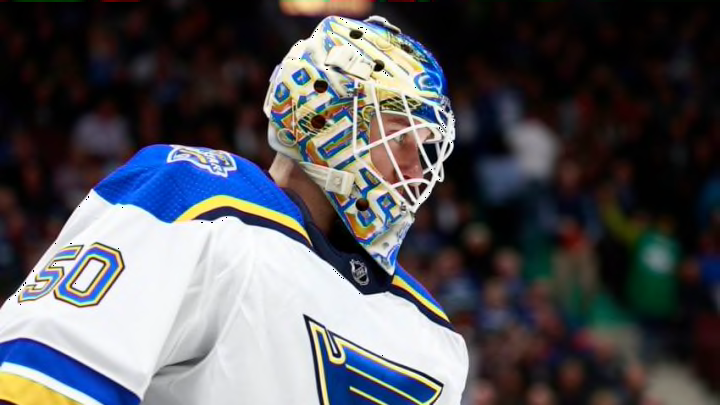
If you thought St. Louis Blues goaltender Jordan Binnington was done with just two masks, you were wrong. His latest edition might be the best.
The St. Louis Blues are off to an excellent start in 2019-20 with an 11-3-3 record in their first 17 games. However, there are still things that can be improved upon. Most people would not count Jordan Binnington among those things that need improving.
However, Binnington is not one to leave things alone if he feels they can be tweaked or added to. So, the Blues goaltender was apparently not finished tweaking his mask design.
Binnington’s mask designer put out a tweet with a link to an Instagram picture which we will show below. Oddly enough, this has slipped through the cracks of the news cycle, unlike some of the other masks.
I suppose you could argue that the trade of Robby Fabbri and the subequent injury to Alex Steen is bigger news. Why dwell on the negative though?
Ever since I was a kid, I loved mask and helmet designs. I would sit there for hours and draw football helmets or hockey masks. Maybe that is why it continues to be appealing to me.
Binnington already had two masks – one which he currently wears and a CuJo homage that will be worn on the 90’s theme nights the Blues will have.
As state in that first article, I was not a huge fan of Binnington’s first mask for 2019-20. It actually looks better on television than I gave it credit for, but it still did not feel like it had that pop factor.
The CuJo mask was simply on point. It was a direct homage without being an outright copy and just hit all the style points.
However, goaltenders are notoriously superstitious. So, it seems a little odd that Binnington would change anything up, given that he is 8-2-3 in his first 13 games and has a save percentage of .921.
Even so, I cannot argue with his and artist David Gunnarsson’s choices with this new mask. It is another home run.
The only negative for this mask design is that it is a little reminiscent of some of the recent Franklin replica mask designs.
"nullnull"
In fact, when one of our other writers, Christopher Griffith, showed our staff the mask, I thought it was one of those masks with a slightly tweaked design. Clearly, I was wrong.
I love the color scheme on this mask. Dark colors just make anything bright pop, so I think the yellow/gold will really stand out on this design.
I am a sucker for that metallic blue look too. Whether you want to consider those stars or simply a chromy/metallic look, I dig it.
I like the utilization of negative space for the blue note too. Instead of having a solid logo, you get the feel of it being just a wire frame to see the rest of the mask through.
Speaking of wire frames, I actually like the little gold splatter on the bars of the mask too. Normally, I dislike having multicolored bars, but it really works for this design.
There is also a cool little lightning effect going on at the forehead and around the logo and words. It reminds me of those little globes you put your hand on and the energy beams focus onto your palm.
Last, but not least, the silhouette of St. Louis on the chin is a nice little bonus. If Binnington had gone with his trademark JB on the chin, nobody would have complained. Having that extra little thing that showcases the city, however, is just a nice extra feature.
Gunnarsson always does great work. Binnington, however much he is involved in the process, continues to make some good choices.
It will be interesting to see how much Binnington uses it. Personally, I would like it if this became his main mask.
I rarely get what I want with that though. I always wanted Jake Allen to use the snake masks more and he was so superstitious that they rarely lasted more than a game or two.
What will also be interesting is whether this is the final mask for Binnington this season. Right now, he is challenging Allen for how many different designs he can have in one year.
Time will tell for that, but this one is definitely a winner.
