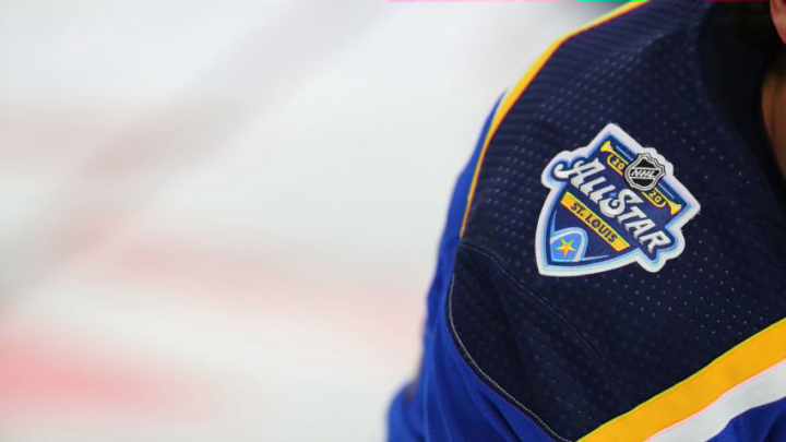
For the first time in over 30 years, the St. Louis Blues will be hosting the NHL All-Star Game. Unfortunately, the sweaters they and others will wear are a big letdown.
All-Star jerseys are always a point of contention for fans, given there is almost no way to please everyone. However, the St. Louis Blues and their fans had to be hoping for something different than what we are going to get.
The Blues will host this event for the first time since 1988. Whether the NHL was just waiting for the right upgrades or they were punishing St. Louis is up to the individual, but it has been a long time coming for these festivities to come to the Gatweay City.
Unfortunately, once the skills competitions end, the event is going to be hard to watch. That has little to nothing to do with NBC’s coverage either.
The NHL unveiled their All-Star jerseys or sweaters or abominations or whatever you want to call them. Of course, there will be some that like them, but I am not one of them.
The league or Adidas or whatever group sat down and came up with these tried, but they could have tried harder. It feels like they were ready to go to lunch and slapped something together just to get out of the office.
🔥🔥🔥🔥
— NHL (@NHL) January 8, 2020
The 2020 @Honda #NHLAllStar Game jerseys by @adidashockey are here! pic.twitter.com/wy43BEQKXj
I will politely disagree with the league’s Twitter account. The only thing fire about these jerseys is that some should be set on fire.
More from Editorials
- St. Louis Blues Need Kasperi Kapanen To Be On Best Behavior
- Hayes’ Debut And Other Bold Predictions for the St. Louis Blues
- St. Louis Blues Captaincy Is Suddenly A Huge Problem For 2023-24
- St. Louis Blues National Games Cause More Problems Than They’re Worth
- St. Louis Blues Brayden Schenn Has To Be An Impact Player In 2023-24
In all honesty, the Blues sweaters don’t look that bad. Our logo is the right color to blend in well with either the white road jersey or the gray home sweater.
The same can be said of teams that have a darker color palate. Other teams were not so lucky.
The Pittsburgh one looks like someone messed with the color or tint setting on an old-school tube TV. The only way the Philadelphia white one can pass is if they make them wear solid orange gloves. If not, it looks like a child tried to color it and went outside the lines. There is just no definition to the logo.
— Mr. Chris G (@ccgrol1784) January 8, 2020
Personally, I am not a fan of the design regardless of the hideous color logos. I fully understand they were going for the musical staff motif, but you would think they would have learned from the Blues’ mistake back in the 1990’s.
Sure, the Blues brought back those jerseys this year. It’s more nostalgia of the players that wore them than wanting to see those actual uniforms though.
In the 2019 All-Star Game, the teams basically wore Sharks uniforms with their own team’s logo on it. Why they did not just use the Blues jersey, with these same color palates is beyond me.
Of course, Twitter has not responded that favorably.
Does the 🔥🔥🔥🔥 refer to where you plan on placing these jerseys?
— Isles Road Warrior (@IslesRW) January 8, 2020
I particularly like the Three Stooges reference.
In a way, I feel bad for the people associated with the NHL and Adidas that came up with these. Regardless of what snarky remarks we want to make, they probably did put in a lot of effort and now they are getting hell unleashed on them.
That’s part of the world of fashion. You put your work out there and either the people love it or hate it. There is not much in between.
There is nothing we can do about it now. The styles are made and locked and sales are underway.
The bad thing is there will almost surely be enough people that buy these to make it worth Adidas’ while. That is odd since the backlash seems like not buying them would send a message, but some people just want what they want.
For me, they do not move the needle anywhere positive. The only thing we can hope for is that these eye sores will at least get to be worn more than once, which means the Central Division actually wins a game.
