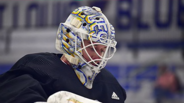
Masks are normally something somewhat personal and showcasing a goaltender’s likes. St. Louis Blues goalie Jordan Binnington went a bit plain for 2021.
While St. Louis Blues goaltender Jordan Binnington has yet to truly wow us with any of his masks since joining the NHL, he has had more than a solid mask game overall. His first offering for the 2021 season is alright, but nothing special.
Peep this sweet new mask for Jordan Binnington, courtesy of @daveartofficial. #stlblues pic.twitter.com/GAtPo0mHic
— St. Louis Blues (@StLouisBlues) December 16, 2020
Binnington’s artist, Dave Gunnarsson aka Dave Art Official, released the photos on the eve of when the NHL hopes to release more information about the 2021 season. As usual, Dave has done a very good job with the concept given to him.
There is nothing wrong with the mask overall. It’s a solid Blues design.
It features the bubbled, 3D Blues logo, which I am always a fan of. I also tend to like when goalies have the logo going both ways, similar to how the arrowhead always points forward on the Kansas City Chiefs helmet.
More from Editorials
- St. Louis Blues Need Kasperi Kapanen To Be On Best Behavior
- Hayes’ Debut And Other Bold Predictions for the St. Louis Blues
- St. Louis Blues Captaincy Is Suddenly A Huge Problem For 2023-24
- St. Louis Blues National Games Cause More Problems Than They’re Worth
- St. Louis Blues Brayden Schenn Has To Be An Impact Player In 2023-24
If I’m honest, I’m souring a little bit on the trumpet. It’s never been a bad secondary logo, but it feels like it has been forced down our throats a little bit lately.
It is a good tie into the reverse retro style, so that is likely a possible reason Binnington chose to include it. It’s not a detraction from the mask, but just a personal thing.
The main problem with the mask, for me, is there is no personalization. It’s basically a fancier version of a genaric mask you might see on a video game.
The only reason you know it belongs to Binnington is because he has chosen to put JB on the chin of all his masks instead of the numbers as some goalies to. That’s probably smart since 50 works on a jersey, but might look a bit more odd on a mask chin.
Another reason it doesn’t stand out for me is because it is very reminiscent of several masks Jake Allen wore over the years. As much as I was a fan of the Snake, his mask game was boring at times.
I loved the snake masks, but Allen seemed to be superstitious against them if he had a poor game. The odd silver mask was just blah.
Binnington has not gone that far to the boring side yet, but it feels like a step backwards. Again, I don’t mind the design in and of itself.
It just seems rather impersonal. I prefer the Binnington CuJo mask or the one that Dave labeled Gritty Blues Chapter III, but those were rarely worn during last season.
Still, it’s a solid mask overall. There is more going for it than not.
Overall, it’s just not my favorite. Plenty will like it though and that’s the cool thing about art.
