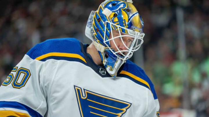
It’s that time of year St. Louis Blues fans. When you’re just weeks, if not days, away from training camp and the opening of the preseason, those of us that love goaltenders get to see all the new artwork featured on the upcoming season’s masks.
Jordan Binnington has an interesting new lid to kick off 2022. It should be said that the team, nor Binnington has showcased this mask as official, but it is depicted on DaveArt’s website, so David Gunnarsson is definitely the artist behind it and he has done all of Binnington’s masks in the last few years.

What is interesting about Binnington’s initial 2022 mask is the focus on duality. We’ve known Binnington only as the ice-cold, “Do I look nervous?” guy the last few years.
Now, through mask form, he’s trying to show the differing sides to his personality, or at least his hockey personality. As the artist calls it, the contrasts of himself.
On the right ear piece, you have the grim reaper in all his ghastly glory. I’ve always been a fan of the traditional depiction of the reaper, though it might have been a little more interesting if the skull was not completely hidden in darkness.
There is a bony jawline as a recessed image just below the ear hole. That will suffice.
Nevertheless, it’s an excellent depiction. The ghoulish, white swirls around the reaper’s waist line are a nice touch.
The left ear, I’m not all that crazy about. However, it’s not my mask, so it doesn’t need to fit my aesthetic choices.
I completely understand the contrast of the darkness and frantic nature surrounding death and the peaceful, serene nature of the Buddha and a tropical island. I guess, for me, it just looks a little too cartoonish?
Given the color palate necessary to keep it in line with a Blues mask, it almost looks like a past version of the St. Louis Billiken. I know it’s not, but that’s what springs to mind.
Even not being overjoyed at that aspect of the design, I like the mask as a whole.
As always, I’m a big proponent of that metallic finish look that is prominent on the chin piece and a few other spots. I particularly enjoy the ripped look on the Blues logo and the number 50 as well.
It can look terribly cheesy or good, but it reminds me of some of those tattoos that look like the image was under the skin and the tears expose it. These are not quite the same since the Blues logo and the 50 are not recessed to look as though they are under the mask, but the slightly frayed edges give that same effect.
As always, David Gunnarsson does solid work. The main question now is how long this mask will stick around.
Goalies are notorious for having multiple cages during a season due to their superstitious nature. Jake Allen might have been the worst in recent Blues memory since he would go through three or four a season and often settle on the most plain one simply because he had a decent game in that one.
I enjoy the more creative masks. This one is not one of Binnington’s absolute best, but it’s a solid entry in his mask game.
We will see if he shows this one off on opening night or debuts a different one.
