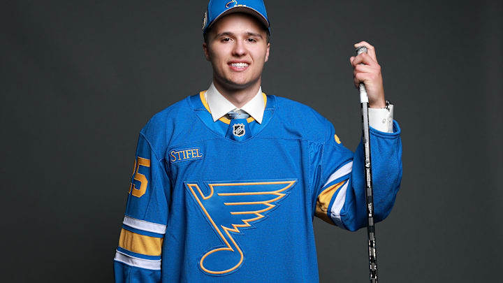
The St. Louis Blues' recent rebrand can chalk up another win. Not only are the new uniforms timeless with a bit of a modern flair, but it also looks like the judges around the NHL are die-hard fans of the look.
Or, at least that's the case with Joe Yerdon of Bleacher Report, who clocked the Blues in at No. 6 in his rankings. Per Yerdon, "In past rankings, we begged and pleaded with the Blues to do something about updating their home and road set. While we won't take credit for the team doing just that this season, we'll take a victory lap for it just the same, because they nailed it."
Honestly, Joe, it was a collective effort, because I'm sure if I dug into the archives, I'd find a few quips where I chastised this look. Oh, and here's a fun fact: I often described the old look as "migraine-inducing," with all the unnecessary dark on royal blue they had going on. The former almost looked black.
Yerdon also shared his take on the Blues going back to the lighter, more classic shade, saying, "While this new jersey is yet another example of why classic looks are best, it's also a prime example of why ditching recent trendy styles was the right move. We'll stop yelling at clouds one of these days, we swear."
The classic look more than wins out for the St. Louis Blues
I could write a bestseller on why classic uniforms always, regardless of the sport, triumph over modern fads that have plagued the sports world for decades. For one, classic looks, even with occasional tweaks to give them a more modern flair, often link to historic fanbases.
Fans today are now rooting for a team that wore a similar jersey to the one fans growing up in the 1960s saw take the ice when the Blues were an expansion team. The shades of blue are almost identical, and if you put the two jerseys up alongside one another, there are just subtle differences.
How did the Blues fare against the rest of the Central Division?
Short answer? They took the crown as far as Yerdon's concerned. The Chicago Blackhawks (14), took the silver medal for the Central, while the Utah Mammoth (15), another team that rebranded, took the bronze.
The Dallas Stars, another headache if you ask me, took 21st, while the Colorado Avalanche clocked in at No. 23. I'll be honest, nothing compares to the old Quebec Nordiques look, so maybe I have a bias in agreeing with Yerdon 1,000 percent that the Avs should be docked into the bottom 10 until they get something with a Nordiques flair.
The Nashville Predators took 26th, and rightfully so. Listen, if you're making yellow the primary color for your home jersey, there needs to be a rule somewhere that your opponent can wear their "dark" jerseys and make this a color vs. color matchup.
The Minnesota Wild came in one notch behind Nashville at No. 27, and until they adopt the old North Stars palette as their primaries, they deserve to sit near the back of the pack. And finally, the Winnipeg Jets rounded out the division at No. 28. Yet another team that should come to its senses and just bring back the classic logo already.
Honestly, if the Jets did that, the Blues would have some competition. But for where it stands, they're kings of the Central Division as far as home jerseys go.
