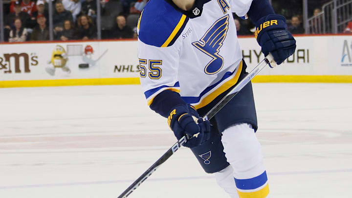
Ah, the sweater. The more technical and traditional term for today's jerseys worn by the players. The term comes from hockey's very beginnings in the early 1900s when players' uniforms were likened more to the standard autumn shirt than the sleek material they are made of now.
The St. Louis Blues have worn several unique sweaters throughout their 58-year history. Here's the best, and some of which should stay in the bin forever.
Best: Winter Classic 2017

In what is now the team's standard alternate sweater, these paler blue and gold outfits debuted in the Blues' Winter Classic clash with Central and longtime rivals Chicago during the 2016-17 season. The Blues' sharp look paid off, picking up a convincing 4-1 win over their biggest rival since the franchise's birth in the 1967 expansion.
These sweaters are a modern variant of the franchise's first ones worn back in the 1967-68 season, which would be their first in the NHL. And it's safe to say that these modern classic mix jerseys aren't going anywhere.
Best: Reverse Retro 2.0, 2022

This batch of the "Reverse Retro," a series by Adidas that started in the 2019-20 season and returned in the 2022-23 season, is the better of the two retro looks for the Blues. Understandably, swapping the classic blue and yellow to get a mostly yellow jersey with blue lettering is risky, as the color yellow itself doesn't match with a lot of stuff! These looks really shine like the yellow on them, though, unlike the Blues' first Reverse Retro entry (more on that later)
Fun fact about the 2022-23 Reverse Retro Blues sweaters- they were actually inspired by what would've been the team's original look, at least as a prototype when the city of St. Louis was first awarded an NHL franchise in 1967, before defaulting to the classic blue and gold mentioned above. Pretty smart change if you ask any hockey aficionado.
Best: Arch Jersey, 2008-14

Worn as an alternate during the heyday of longtime captain David Backes and several other stars, this sweater doesn't quite get the recognition it deserves. What better way to represent the city you play in by adding the aspect of one of the country's most famous landmarks?
In addition, they make it work as well, something that had to be challenging to pull off, and you get a nice mid-2000s look that any big hockey fan would probably have in their collection closet.
Worst: Reverse Retro 1.0, 2019
The Blues weren't the only team in the league to have a mediocre sweater for their first throwback look. Colorado's wasn't hot either before making a much better switch, for example. And there's a reason the Blues don't wear red in today's game because these sweaters just weren't it.
Inspired by the Blues' mid-90s look when they somehow managed to snag Wayne Gretzky (yes, that Wayne Gretzky) on his way to the New York Rangers in the final years of his legendary career, these were the first Reverse Retro look for the team, and also another palette swap like their second RR look.
But while the regular 90s Blues jerseys were OK, eventually also becoming a brief "heritage" look for a couple of games (as in literally three games during the 2019-20 season, the flipside, mostly red sweater was just... loud. A little too loud. I get it; it was the '90s, a wild place. But they pushed it here.
This first attempt at a classic/modern mix is a color swap of what the Blues' jerseys looked like for their road uniforms from 1995-1998. St. Louis didn't hit the ice wearing this red variant too many times, probably because of poor fan reception off the ice.
