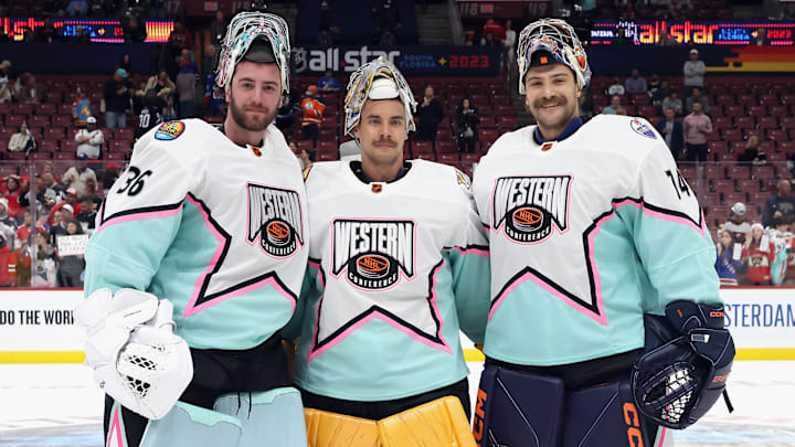
The NHL unveiled the 2024 All-Star Game jerseys. Many times that is cause to be excited.
Not this time around. The league went full on create a jersey for street hockey in EA Sports' NHL games for these things.
More often than not, I can acknowledge when I am not the core audience for something and I will gladly do that here. However, I'm not old enough to no longer be part of the NHL's fan demographic, so the fact they are skewing so young now makes it feel even more like a cash grab.
I will be honest and say I remain old school. I don't generally care for Adidas' hockey jerseys where they force their tri-stripe design onto it.
Some jerseys have managed to pull off the look. Others are better left to being practice jerseys or utilized on the soccer field.
For this design, for me anyway, it is more about the colors than the overall design. It's just too cartoonish.
I like the NHL All-Star jerseys. They’re a lot of fun save for two things (and acknowledging I’m not the target audience):
1. Don’t dig the yellow one (but that’s a drew house trademark)
2. I want just the NHL crest and the star behind it, without the smaller stars pic.twitter.com/JSSw4lJSyW
The red one looks like it belongs in a McDonald's commercial. Red and yellow is a difficult combination to pull off anyway, unless you're Hulk Hogan or Iowa State and even they have had their ups and downs.
The yellow one is just awful. Blues fans, let this be an example of why asking for yellow jerseys is almost always a bad idea.
The throwbacks the Blues wore in 2022-23 were decent, more because of the logo than their color scheme. There was at least enough blue to slightly offset it.
Even though we are accustomed to the Nashville Predators wearing yellow, it just doesn't scream yellow. This thing is simply in your face yellow all over with nothing to break it up.
The blue one is...ok, I guess. There's nothing overly wrong with it, other than it's just another example of the general design not working for me. It honestly looks like a 12-year old made it for a video game. Perhaps that's the entire idea, but it doesn't click for me.
The white one actually looks alright. It has some of the same flaws, but it looks crisper and cleaner. The gold, or yellow, on the logo is more subtle against the white and less harsh. Conversely, the black of the Adidas stripes pops better.
Clearly, based on the design, the league is trying to pull in new fans from outside their traditional base. That's great. The more people involved in the game, the better.
For me, hockey has always been more about tradition and connecting with that, rather than forcing something new.
I'm sure the league will sell enough of them to consider the design a success. I will definitely not be buying one, even if my favorite player of all time was wearing one.
I'm not sure how they will decide which division wears what colors. I'm hoping the Central Division gets the white ones, because I would prefer not to see Robert Thomas wearing one of those other ones.
I hope they at least continue the practice of wearing their actual team jerseys for the skills competition.
