

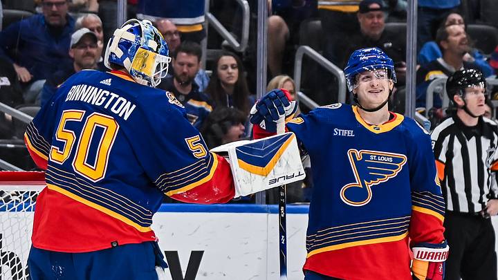
On Monday, the NHL dropped its long-awaited "Hometown Remix" jersey collection, featuring new and retro-inspired designs for all 32 teams. That, of course, included the St. Louis Blues, and there were several of their fellow Central Division teams that knocked it out of the park with their designs. But who took home the best design and, more importantly, where did St. Louis rank among its Central Division constituents?
1. Colorado
Our state. Our team. Just remixed 💿
— Colorado Avalanche (@Avalanche) November 2, 2026
Get your Hometown Remix jersey now: https://t.co/NvM2jMb01O pic.twitter.com/vMIpXuWPx2
The Avs have always known how to make a fantastic retro-style jersey, and this latest one proves it. Featuring a deep, bright blue that undoubtedly inspires the Rocky Mountains, Colorado, yet again showed why it's one of the best teams in the league when it comes to making alternate sweaters. Add the silver accents, and you get a wickedly cool combo that's just as ice cold as the entire state of Colorado in the winter. Speaking of the state of Colorado, the Avs, of course, didn't forget to incorporate their state flag motifs into it, and lots already think Colorado has one of the top-tier state flags in the country with that abstract letter C and a perfectly complementary navy, red, and yellow color palette. This jersey is so fresh it makes Coors Light jealous!
2. Nashville
It’s all in the details 🤌
— Nashville Predators (@PredsNHL) November 2, 2026
Get your own Hometown Remix jersey online or in store at @NSHLockerRoom today from 3-6 p.m. pic.twitter.com/21tTxEgMJz
The Preds went with a sleek navy look instead of potentially going with another bright gold look, but they did dial up the flair with said gold, particularly along the shoulders with the detailed lines and, of course, the center logo itself. It's a great look for the team in the Music City, clearly incorporating the proper elements to make a jersey much better than their Reverse Retros, which were OK at best. Their first RR was pretty good, even with the white-eyed Predator being a little iffy. But we don't talk about the 2.0- that horrible-looking, almost cartoonish 3D Predator head, along with the strange choice for a more mustard yellow color than the goldenrod they have today, was not a good look then, and it'll never be a good look ever again. Nashville smashed that design and played it safe here, to the delight of many.
3. St. Louis
It’s our team. It’s our music. It’s our way of life. And it’s all represented in the St. Louis Blues Hometown Remix jersey. #stlblues #NHLHometownRemix pic.twitter.com/wMbvfqGnJn
— St. Louis Blues (@StLouisBlues) November 2, 2026
The Blues went a bit in a different direction while still calling on their retro jersey aspects, taking inspiration from their 3rd jerseys worn from 2011-2016, featuring the team logo inside of the famous Arch- because it isn't a true St. Louis look without it! This new sweater also features river line patterns, which are an obvious nod to the Mississippi River, which runs right by the state of Missouri as it works its way from upper Minnesota to the Gulf of Mexico, passing directly through downtown St. Louis in the middle portion of its route. The river is also why this jersey has a black coloring to it rather than a navy or bright blue look, like how the Blues' current alternate jerseys look- the waters of the Mississippi are often very dark and murky, but it's still the vital lifeline in this entire country.
4. Utah
A closer look at the details of 𝐔𝐭𝐚𝐡. 🧵 pic.twitter.com/bI40sttluT
— Utah Mammoth (@utahmammoth) November 2, 2026
The NHL's newest franchise (well, kind of) had a big task- create their first retro/alternate jersey for a team that's only been around for 3 seasons now. And they succeeded in the latter, since a team of their youth doesn't exactly have the details to create a retro look- at least not for another decade, maybe. But when the primary color is that new bright sky blue with a fancy scripted letter U prominently on the front, that's a success no matter how old or young your team is. It's a great starting effort for the NHL's youngest franchise and one with one of the more unique team names in the league. The wave pattern going across the letter U is also a nice touch. And one can even suspect that very wave pattern is actually a hidden tusk shape, which for a team nicknamed the Mammoth? Perfect. Very well done for Utah's first major alternate jersey.
5. Winnipeg
The home you know and love, brought to life in a way you can wear proudly. pic.twitter.com/kEA0rpTtOI
— Winnipeg Jets (@NHLJets) November 2, 2026
This was a very close decision between the Jets and Wild, as both released similar, mostly black looks as the Blues did. The neon blue glow is what sets Winnipeg apart here, though. An Aurora Borealis on a hockey jersey? Quite an interesting concept that, of course, looks sharp. At least, it would if the rest of the jersey had even more flair to it. You can't go off a black base all that much, but at least the Jets did a good job here. The Blues just had some better motifs to work with. Maybe if the Jets had incorporated some of their '90s looks into this or done something similar to their phenomenal pale blue Jets script font jersey, it'd give them an extra boost in how this one in particular looks. It's still a solid jersey- just missing some extra details like these other ones.
6. Minnesota
The details tell the story.
— Minnesota Wild (@mnwild) November 2, 2026
A closer look at Hometown Remix and the Minnesota inspiration woven into every thread. pic.twitter.com/KlkepAWV5V
You can call this one a toss-up between the Wild and the Jets, put Minnesota higher because it is the state of hockey, after all, but in any case, the Wild could've used some brighter colors here, especially after their Reverse Retro 2.0 became one of the best of that batch with its sharp royal green and gold color combo. Not many combinations are as timeless with one color and a goldenrod shade, so this is a bit of a downgrade with Minnesota's current look here. The Northern Stars decorated all over the sleeves are definitely a nice touch and an homage to the last team to call Minnesota home, the North Stars, who, oddly enough, wore that very royal green and goldenrod combination from 1967-1993 before they headed way south to Dallas. And speaking of Dallas...
7. Dallas
The city’s in every stitch. pic.twitter.com/qeiEukxt7m
— Dallas Stars (@DallasStars) November 2, 2026
Now we're getting into the somewhat minimal effort tier. Like St. Louis, Dallas took inspiration from its own alternate jerseys, which were all black with a pale neon green, almost São Paulo green color. The team wore these from 2021-2025 and has since updated that with a 90s-inspired pattern that, of course, keeps the modern logo as opposed to the mid-2000s team logo that was a bit more wordmark in nature. The neon coloring on the black and white background, plus the striped-looking center logo, is great, but that's about the only different thing about it. Remember, their previous neon look was retired just last year. This is basically a design that didn't make the final cut. It's still good, it's just not what you'd expect when the team had an eerily similar pattern not long ago.
8. Chicago
our favorite shade of green: pic.twitter.com/T6vsQVF2G4
— Chicago Blackhawks (@NHLBlackhawks) November 2, 2026
Did the Blackhawks even do anything? Other than the off-white stripes on the bottom, this looks more like a St. Patrick's Day game look than a consistent alternate design, and for Chicago, a city with one of the largest and most famous St. Patrick's Day celebrations in the country (turning the Chicago River Kelly green and a massive rubber ducky river race, among other festivities), this is a big swing and a miss. The only way it's not a St. Patrick's Day jersey is that the logo itself isn't a pale green color. Of course, that would make it look too warm-up-esque, which would be even worse, but Chicago was definitely one of the biggest misses in the entire Hometown Remix collection, right down there with Detroit, New Jersey, and others also in the same did you even do anything department.
 Add us as a preferred source on Google