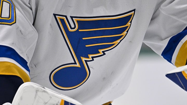
The day has finally come for the St. Louis Blues rebrand. Many have speculated whether it was a logo enhancement, an overhaul of the jersey, or perhaps a combination of both. But the time has finally come to put all of the rumors to rest.
Introducing the new-look St. Louis Blues
A classic look for a new era. #stlblues pic.twitter.com/84lGIIaPnI
— St. Louis Blues (@StLouisBlues) June 24, 2025
This new look will usher in a new era of Blues hockey. The surprising appearance in the Stanley Cup Playoffs last season is a precursor of what is to come. With a new logo and jersey, their identity is now focused on the future. There have been a number of changes in the past, with this being the first major one since 1999.
Look good play good
The new cosmetics are a refreshing change. The Blues are heading into a new direction, with the joy and sensation of the 2019 Stanley Cup victory starting to fade away. This fanbase is yearning for another Stanley Cup, and the front office believes in this group.
#NewProfilePic pic.twitter.com/3r8vJPXBaa
— St. Louis Blues (@StLouisBlues) June 24, 2025
If you have heard of the saying, "look good, feel good, play good", it goes along with this. The Blues have a new look, and it joins one of their Central Division rivals. The Utah Mammoth have entered the fold, finally taking a name after being the Utah Hockey Club last season.
How do you like the rebrand? Is it a step in the right direction, or a henious act on the long-storied history of the Blues identity?
