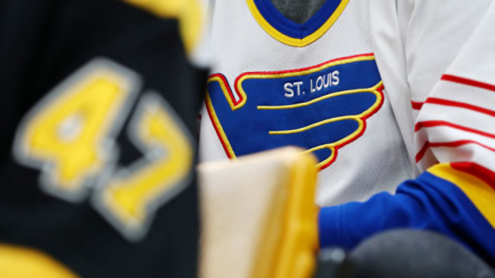
The St. Louis Blues had fans split on their recent retro third jersey. The reverse retro won’t unite those fans much.
Well, the leaks turned out to be correct. The St. Louis Blues reverse retro is a red version of the jersey that caused so much division back in the 1990’s.
The jersey that was lovingly, or perhaps not so lovingly, referred to as the “clown jersey” is what Adidas chose to flip the color scheme with. Admittedly, that is an assumption that this was Adidas’ choice and not the team’s.
For all we know, the Blues had input. Perhaps they made the final decision.
That’s unknown right now. All we do know is you better get used to the Blues wearing the main color of their chief rivals whenever they wear these things.
FIRST LOOK! Check out a photo gallery of the new Blues' #ReverseRetro jersey from adidas.
— St. Louis Blues (@StLouisBlues) November 16, 2020
VIEW PHOTOS >>> https://t.co/MwLJAjAAp4 pic.twitter.com/AylpOnUdjL
I’ll be honest – I don’t hate these things. I went in expecting to think it was the third-worst thing ever.
More from Editorials
- St. Louis Blues Need Kasperi Kapanen To Be On Best Behavior
- Hayes’ Debut And Other Bold Predictions for the St. Louis Blues
- St. Louis Blues Captaincy Is Suddenly A Huge Problem For 2023-24
- St. Louis Blues National Games Cause More Problems Than They’re Worth
- St. Louis Blues Brayden Schenn Has To Be An Impact Player In 2023-24
For me, the worst would have been that monstrosity of a sweater that featured the trumpet emerging from the bottom that Mike Keenan thankfully nixed. The second worst would have been a yellow Blues jersey.
The funny thing is how much an actual product vs. a mockup can be. While it’s the exact same jersey design, I did not like the digital version of this red jersey that leaked a few days prior.
For whatever reason, that picture seemed to take everything Adidas did right with the blue retro version we saw in 2020 and flush it down the toilet. The red did not seem quite right and nothing really fit.
However, upon first viewing of the actual jersey on a human being in the photos, it actually doesn’t look that bad. I don’t see myself getting one, but the product outdoes the concept.
Personally, I still wish they had gone with the jersey the Blues wore from the late 1970’s through the mid-1980’s.
"nullnull"
You could easily keep the body either blue or white. Then just reverse the color scheme of the shoulders for a tweak.
Sure, some might call it lazy, like the Philadelphia Flyers. At least there would be some sort of change.
The New York Islanders basically did nothing. Yeah, different color blue yada yada yaada. That’s the same Islanders jersey.
If we are all honest, even if you don’t like it, it could have been a lot worse. The Anaheim Ducks brought back those terrible cartoon jerseys instead of just going with the sharp Duck mask logo.
Detroit just turned their red stripe gray, since gray is apparently reverse somehow.
Overall, it’s going to split fan reaction. I’ve already seen a lot of Twitter posts that love it and hate it.
Like the jersey style that it emulates, it’s going to have its fans and those that despise it. One thing I don’t care for about these is that the numbers are shiny, like they were painted on like knockoff jerseys. Hopefully that was just a quick iron-on for the photo shoot and not how they will actually be.
My only real gripe is that the Blues main rivals are red. We have enough problems with having too many red jerseys in the arena as it is and now they come out with a red version of the Blues jersey.
I get that this harkens to the city flag, but meh. It’s not nearly as bad as I thought it would be and in the right light, it’s actually decent. There were just other ways to go. If you want to look at all 31, check out CBS Sports’ reaction.
