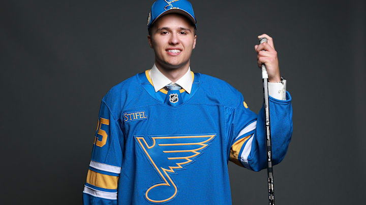
As you now know, the St. Louis Blues (finally) rebranded for the 2025-26 season. And wow, was it long overdue. To be real, I never liked the navy-on-royal look. Literally, to the extent that it was so migraine-inducing I couldn't stand the sight of it longer than a minute or so.
If it wasn't for the fact that they still had a blue music note emblazoned on the front, the entire uniform would've been a thumbs down, and it's the one element that (somewhat) saved it. They owned variations of that look since 1998-99, and no matter how they spun it, it never got any better.
I know some have criticized the mid-1990s sweater, with the addition of that bright red (red-orange?) into the scheme. Maybe it's because I have a bias for the mid-'90s or something, but I've always liked that one. It had a fun look, and I'm glad to see it worn at times.
The latest jersey has elements of those original Blues jerseys that debuted all the way back in 1967, and with elements from their "Winter Classic" look. I call this one a 'modern classic,' not much different from what the Buffalo Sabres did a few years back when they reverted from navy to their original royal blue and gold look.
Yes, this is the best primary St. Louis Blues jersey of all time
We've basically already seen this one on the ice, and it's an ode to what makes hockey so great. It's notorious (in a good way) for modern classics, while alternate uniforms actually look like they belong with the team.
So, rebranding with this look was far and away the smartest thing to do because it harkens to the original look while adding a modern flair. There's no radical redesign here that makes zero sense, and no "storytelling" on the look that makes zero sense to everyone but the manufacturer and the PR department.
Further, it brings back the traditional colors, which immediately upends the mid-90s redesign that I ironically don't mind and it's light years ahead of what I guess is the 'championship' color scheme. This is when compared to uniforms that were worn regularly, so I'm not counting alternates here. Even if the Blues had some cool ones, like what they wore in the 2025 Winter Classic.
The Blues and the NHL once again got this one right in a historic way
In the NFL, for example, you don't get that, with teams like the Cleveland Browns recently releasing what may be the worst alternate uniform in NFL history. As for the "City Edition" NBA threads and "City Connect" MLB threads, yeah, they're not much better, and you get the point.
Here in the NHL you need to ask yourself, "Who's next?" Like I said earlier, the Blues got this right in a big way, as did the Sabres a few years back. You can also put teams like the San Jose Sharks, Calgary Flames, and, also this season, the Boston Bruins, in those categories.
Heck, when Utah unveiled their nickname, I expected a horror show. What I got was, ironically, a timeless look. If the league keeps heading in this trajectory, then who's next?
The Minnesota Wild would look good in something reminiscent of the North Stars. And the Dallas Stars, ironically, could rock if they revert to their original design that was, ironically, the North Stars' last design before they took off for Dallas.
Who knows? But I do know this: The Blues got this one more than right earlier this summer, and the NHL, as a whole, is laying a blueprint for the Four Major Pro Sports leagues of what uniform redesigns and rebrands should look like.
More from Bleedin' Blue
